DATA INTERPRETATION
DI QUESTIONS FOR ALL BANK EXAMS, IBPS PO CLERK, SBI & RRB
Accent Coaching Institute Hisar
Best coaching Institute in Hisar for Competitive Exams:
Contact No. : 96716-39776, 95410-79129
Accent Coaching Institute is a well-known Coaching Institute of Hisar provide Best Competitive Exams Coaching in Hisar (Haryana)
Here Teacher Teaches with Tricky Techniques (…Has been awarded for Best Institute Award on 5 Sept. 2016)………
Tricky Methods based on left brain……which…
–Improves your memory
–Enhances your imagination
–Retrieves important information
–Sensory stimulation
In IBPS exam if you Solve even Just 60% of the DA and DI questions its clear that you have Passed the Maths Section.cat data … Why DA and DI is Important part of Bank PO exam ? …. Solution DI Set 01: Pie Chart with Explainations/Shortcuts
Call Now for Tricky (DI) Coaching In Hisar – 95410-79129 , 96716-39776 Accent Institute Hisar
Today I am going to discuss the Top 15 Best Techniques,Tricks and Tips for Solving the DI and DA questions just in Few seconds. We will also discuss in details how to solve toughest DI of SBI, other PO EXAMs…..and we will solve some practice set after reading the article. I have compiled from various sites….a good study material for you in a one place. Hope you will enjoy it….First we will discuss about various tips and tricks for solving DI/Data interpretation….So get ready for DI solving tricks and tips.
Data Interpretation ( DI ) and Analysis ( DA ) is Very time consuming Topic in any Common written exam Like IBPS,SBI PO,SSC, Clerical etc.In IBPS exam if you Solve even Just 60% of the DA and DI questions its clear that you have Passed the Maths Section.cat data interpretation tricks questions and answers pdf
Why DA and DI is Important part of Bank PO exam ?
If you are a PO or even in a clerical Department in any Bank,You have to work with Deposit ,Withdrawal etc. figures.Their is no such day on which no statistical work is done.So every bank wants the employers who can take decisions and Knows well how to Calculate these statical data Just in few seconds so bank performs its work smoothly.
Data Interpretation :-
As all of you know Data can be written or represented in 4 Forms
1. Numrical :- Data in numercial form
2. Table Form :- Data in Tabular form
3. Mixed form :- Data in Mix Form
4. Graphical form Like Line ,Bar graph etc.
Must Have Tips for DI and DA :-
1. Always keep in your Mind that in the circular Graph or Charts 100% =360 Degree .
2.Formulas and Full Concept of Percentage ,Average, Approx. Value and Ratio.
3.While solving keeps in mind that which Type of Graph is using in the question this will help you to get the correct answer.
4.First Read the Question and try to interrupt in the question as the Topics says DATA INTERPRETATION.Because every bank wants the PO who can handle and Play with numbers of Figures just in few seconds and not just calculate it with closed eyes.
5.The whole of the DA concept is based on Calculation so if you want to be perfect in DA and DI don’t even use calculator at home while practicing.One who can calculate fast and accurate even Large numbers without calculator is 50% ready for the Any Aptitude test.
6.Try to use your mind while solving DA questions. Try to write only important Lines on the paper and Others just write and calculate in your Mind.This can be easily done by practicing More and More at Home.
7. Don’t feel confusing and no need to Try and Solve all the questions only Focus on questions with you are more familiar and you find yourself in such a way that you can solve the question accurately.
8.Try to solve all types of Questions while practicing this will not confuse you in the exam.
Data Interpretation Set 01: Pie Chart
The following pie chart cost of constructing one house. The total cost was Rs. 6 lakhs. (source FCI/SSC Nov. 2012 Paper)
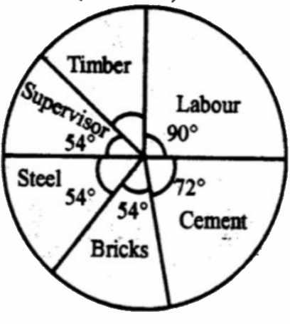
1. The amount spent on cement is
2. The amount spent on labour exceeds the amount spent on steel by
3. The amount spent on cement, steel and supervision is what percent of the total cost of construction?
|
4. The amount spent on labour exceeds the amount spent on supervision by
5. The amount spent on Timber is
|
DI Set02: Pie-Chart CO2 Emission
The total annual CO2 emissions from various sectors are 5 mmt. In the Pie Chart given below, the percentage contribution to CO2 emissions from
various sectors is indicated.

1. Which of the following sectors together emit 2.5 mmt of CO2 every year?
|
2. Which of the following sectors have emission difference of 1 mmt between them.
|
3. Emission of Domestic sector is how much % of Transport and Commercial sector combined?
- 20%
- 15%
- 30%
- 35%
4. In the next year, if emission from Commercial sector decreases by 20% of its current emission, while other sectors continue to emit same
amount of CO2 as earlier then What will be the new % contribution of Thermal power sector (approximately)?
- 31.9%
- 39.8%
- 42.7%
- 36.5%
5. Which of the following is incorrectly matched?
a) Domestic=54 degrees.
b) Thermal=125 degrees.
c) commercial =72 degrees.
d) transport=108 degrees.
Continue reading the article, we have solved these questions.
DI Set #3: Bar graph on Profit-loss
Observe this graph and answer questions (source FCI/SSC Nov. 2012 Paper)
1. The amount of maximum profit as seen from the diagram is
2. The amount of total loss incurred during 2005-2010 is
|
3. The ratio of the maximum profit earned to the minimum loss suffered is
4. If the loss is x% of the profit for the years under study, then x is
|
Solutions for the DI questions
Solution DI Set#1: Pie Chart with Explainations/Shortcuts
You might be tempted to transform degrees into percentages and find absolute Rupee value of each item (timber, labour etc). But in the exam,
don’t waste time by calculating everything. Only calculate the stuff that is asked.
1. The amount spent on cement is
- Rs.2,00,000
- Rs.1,60,000
- Rs.1,20,000
- Rs.1,00,000
Total is Rs. 6,00,000 (=360 degrees of the circle)
Cement is 72 Degrees.
Apply the ratio principle
| Degrees | Value |
| 72 (Cement) | M? |
| 360(total) | 6 lakhs |
Divide left column on one side and right column on the other side.
72/360= M/6 lakhs
M=(72*6)/360=1.2 lakhs.
2. The amount spent on labour exceeds the amount spent on steel by
- 5% of the total cost
- 10% of the total cost
- 12% of the total cost
- 15% of the total cost
There is no need to find absolute values. Just observe the degrees.
| Item | Degrees |
| Labour | 90 |
| Steel (Base %) | 54 |
| Difference | 36 |
So the difference between Labour and Steel is 36 degrees.
And total cost is (6lakh=) 360 degrees.
So the percentage= 36/360 x 100 =10% of the total cost.
Answer (B)
3. The amount spent on cement, steel and supervision is what percent of the total cost of construction?
- 40%
- 45%
- 50%
- 55%
Again no need to find absolute values. Just observe the degrees.
| degrees | |
| Cement | 72 |
| Steel | 54 |
| Supervision | 54 |
| Total | 180 |
He is asking, “what percent of the total cost of construction?”
So total cost (360 degrees) is the “base”
%=(180/360) x 100
=50%
4. The amount spent on labour exceeds the amount spent on supervision by
- Rs.2,00,000
- Rs.16,000
- Rs.1,20,000
- Rs.60,000
Again no need to find absolute values for both items. Just observe the degrees.
Difference between labour and supervision
=90-54
=36 degrees Shortcut: 36 degrees =10% of a circle. (because total is 360 degrees)
So the amount spend = 10% of total (6,00,000)= one decimal leftwards=60,000.
If shortcut is not clicking your mind, no problem. Go by ratio principle
| Degrees | Value |
| 36 (difference between labor and supervision) | M? |
| 360 (total) | 6 lakhs |
Divide left column on one side and right column on the other side.
36/360= M/6 lakhs
M=(36*600000)/360
M=60,000
Answer is (D)
5. The amount spent on Timber is
- Rs.60,000
- Rs.90,000
- Rs.1,20,000
- Rs.36,000
Observe that degree/percentage of Timber is not given the chart.
So, first task is to find degrees of timber.
In a circle Total=360 degrees.
So Timber’s degree
=360 MINUS the degrees of remaining items
=360-(54+54+54+72+90)
=36 degrees.
Now use the concept given in previous question,
36 degrees= 10% of total cost=60,000 rupees.
Answer (A)
Solution: Set #2: CO2 Emission Pie Chart

1. Which of the following sectors together emit 2.5 mmt of CO2 every year?
- Thermal and Transport
- Domestic and Commercial
- Transport and Commercial
- Commercial and Thermal
Total emission is 5. And 2.5mmt is 50% (half) of 5 (total emission)
From
the given circle, transport + commercial, represent half circle (50%)
Similarly Thermal+Domestic is also 50%. But it is not given in
options. So answer is (C): Transport + Commercial.
2. Which of the following sectors have emission difference of 1 mmt between them.
- Domestic and Commercial
- Transport and Commercial
- Thermal and Domestic
- Thermal and Transport.
- Total is 5mmt (100%) So 1mmt=1 x 100/5=20%.
- Find out which two sectors have % difference of 20%?
- Thermal minus Domestic=35-15=20%. So (C) is the answer.
3. Emission of Domestic sector is how much % of Transport and Commercial sector combined?
- 20%
- 15%
- 30%
- 35%
Observe the chart
Required %
=(15/50) x 100
=30% answer is (C)
4. In the next year, if emission from Commercial sector decreases by 20% while other sectors continue to emit same amount of CO2 as earlier then what will be the new % contribution of Thermal power sector?
Right now Commercial sector emits 20% of 5mmt=1/5 x 5=1mm
Next year 20% decrease=20% of 1mm=0.2mm will be less emitted.
But other sectors remains the same.
So total emission next year=5 minus 0.2=4.8mm.
And Share of thermal power
=(35% of 5)/4.8
=0.35*5/4.8
=36.5%
5. Which of the following is incorrectly matched?
a) Domestic=54 degrees.
b) Thermal=125 degrees.
c) commercial =72 degrees.
d) transport=108 degrees.
100%=360 degrees So 1%=3.6 degree.
Multiply every sector’s % with 3.6 and you’ll get corresponding degree.
Ans (B) because correct degree of Thermal should be 35 x 3.6=126 degrees.
Solution :Set #3 Bar Chart (With explanation)
Be careful about the ‘unit’, Thousand/lakhs.
1. The amount of maximum profit as seen from the diagram is
- 2 thousand rupees
- 1.5 thousand rupees
- 1 thousand rupees
- 4.5 thousand rupees
The bar of 2008 is longest among all. So 4.5 Ans (D)
2. The amount of total loss incurred during 2005-2010 is
- 3 thousand rupees
- 2.5 thousand rupees
- 1.5 thousand rupees
- 2 thousand rupees
Loss occurs during 2006 and 2009.
| Year | Loss |
| 2006 | 1.5 |
| 2009 | 1.0 |
| Total | 2.5 answer (B) |
3. The ratio of the maximum profit earned to the minimum loss suffered is
- 4 : 3
- 3 : 4
- 9 : 2
- 2 : 9
| Max profit (2008) | 4.5 |
| Min Loss (2009) | 1 |
Ratio=4.5/1=45/10=9/2
Answer (C)
4. If the loss is x% of the profit for the years under study, then x is
- 15
- 25
- 20
- 19
We’ve to take the total of profits and losses made in all years so,
| Profit | Loss | |
| 2005 | 2.5 | 0 |
| 06 | 0 | 1.5 |
| 07 | 3.5 | 0 |
| 08 | 4.5 | 0 |
| 09 | 0 | 1 |
| 10 | 2 | 0 |
| Total | 12.5 | 2.5 |
Profit: Loss
=2.5/12.5
=1/5
=20%
Answer is (C)
1. Introduction: Tabular presentation
A table is a set of data arranged in rows and columns and is one of the most common way of putting information across to people. A table consists of several boxes with information inside. The first row and the first column are generally used to denote the titles. While any type of data can be presented in table form, that too in a very accurate manner, interpreting the data in table form is more difficult and time consuming than the other modes, all of which are basically pictorial or graphical in presentation.
2. Tips on Solving Table Chart Problems:
A: Read the data very carefully, as the smallest detail may change the meaning of the question completely. Similarly, the instructions have to
be understood carefully to prevent wasting time in calculating data that is not required, and also to find out exactly what is the answer that
is sought.
B: Try to understand the data provided carefully, before jumping to answer the questions. The questions are designed to be deceptive, and proper understanding of the requirements is a must. If the Data provided is of the combined variety or if there are more than one data table/charts/graphs, try to understand the relation between the given tables.
For Example, one table may talk about absolute sales figures, while the other table may talk of sales as a percentage of production. Hence, any question on excess production or Goods in stock, will require data from both tables.
C: Be very careful of the units used in the tables, and the units in which the answers (options) are provided. A mistake in the units may yield an
entirely different answer. Also be careful of whether the answer is required in decimal or percentage. Such errors are common and easily
avoidable.
Here is an example consisting tabular data:
Example 1:
|
Category of Assistance
|
Average number receiving per month
|
Total cost per help year(in crores of Rs.)
|
Cost paid by Centre for the year (in crores of Rs.)
|
|||
|
1995
|
1996
|
1995
|
1996
|
1995
|
1996
|
|
|
A
|
36097
|
38263
|
38.4
|
34.8
|
18.4
|
17.4
|
|
B
|
6632
|
5972
|
5.0
|
3.2
|
2.6
|
1.6
|
|
C
|
32545
|
31804
|
76.4
|
59.4
|
13.0
|
10.0
|
|
D
|
13992
|
11782
|
26.4
|
42.6
|
6.6
|
10.6
|
|
E
|
21275
|
228795
|
216.6
|
242.8
|
55.0
|
62.6
|
Example 1.1:
The category receiving the least percentage help from the centre (in the entire data) is:
(A) Category B in 1995
(B) Category C in 1996
(C) Category B in 1996
(D) Category D in 1995
Solution:
In this type of question, it is better to examine the alternatives given rather than trying to find the least percentage from the table. Let us now calculate the required percentage of the given alternatives:
(A) Category B in I995 =(2.65.0)×100=52% (Even without calculation, you can eliminate this choice.)
(B) Category C in 1996 was =(10.059.4)×100=16.8%
(C) Category B in 1996 was =(1.63.2)×100=50% (Even without calculation, you can eliminate this choice.)
(D) Category D in 1995 =(55.0216.6)×100=25.4%
From this we arrive at the answer
(B) since this is the least percentage.
Example 1.2:
The difference between the average costs paid by the Centre during 1995 and 1996 is
(A) Rs. 66 lakh
(B) Rs. 13.2 crore
(C) Rs. 132 lalth
(D) Rs. 13.2 lakh
Solution:
Adding all the cost figures in the 1995 column, i.e. 18.4+2.6+13.0+6.6+55.0, you get 95.6.
The average in 1995: =95.6+ Number of categories =95.6+5 = Rs. 19.12 Crore
Similarly, the average in 1996: =(17.4+1.6+10.0+10.6+62.6)5 = Rs. 20.44 Crore
The difference = Rs. (20.44−19.12) Cr = Rs. 1.32 Cr = Rs. 132 lakh
The correct answer is (C).
(Note how the answer needed conversion from crores to lakhs).
Example 1.3:
Monthly cost to the city receiving E category assistance in 1996 is most nearly:
(A) Rs. 1.8 crore less than that in 1995
(B) Rs. 2.1 crore more than that in 1995
(C) Rs. 2.1 cnore less than that in 1995
(D) Rs. 1.8 crore more than that in 1995
Solution:
Here, straight calculation is only needed. We need to look at the total assistance figures.
In 1995: 216.612=18.05
In 1996: 242.812=20.23
Difference = 2.183 crore ≈ Rs. 2.1 crore
The correct answer is (B).
Example 1.4:
Assuming
that 50% of the persons receiving category B help in 1995 were adults
caring for minor children, but the city’s contribution towards
maintaining these adults was 40% of the total contribution to B program
in 1995, average amount paid by the city for each adult per year in 1995
is most nearly:
(A) Rs. 5900
(B) Rs. 6000
(C) Rs. 7500
(D) Rs. 3000.
Solution:
50% of persons receiving B category help during 1995 =3316
City’s contribution to maintenance: =5.0×0.4
= Rs. 2 crore =2,00,00,0003316
= Rs. 6031.36
= Rs. 6000 nearly
The correct choice is (B).
Example 1.5:
Monthly costs to the city of category D during 1995 and 1996 bear a ratio (most nearly)
(A) 2 : 3
(B) 5 : 3
(C) 3 : 2
(D) 3 : 5
Solution:
Again, we can straightaway determine the answer through simple calculation.
Since a ratio is required to be calculated, we can avoid the division by 12.
Directly from the table we have, total assistance in 1995 and 1996 for Category D as 26.4 and 42.6.
Hence the ratio is 26.4:42.6=3:5 nearly.